A utility app that let users discover, save, and share recommendations with others.


Overview
The team consisted of three people. I worked with a product manager, and an engineer to build the product. My role was Product Designer. I designed, prototyped, and tested the designs. I collaborated with the product manager and engineer on research and implementation. We launched our MVP in the App Store. The project took five months to complete.
Problem
New and existing content is constantly recommended by peers. Looking for interesting content can be a time-consuming process. There aren't any good solutions or all-in-one apps to capture these recommendations. Each category type requires a different app. For example—Netflix for TV/movies, Goodreads for books, and Spotify for podcasts.
Goals
- Reduce time spent researching for new content.
- Organize and consolidate recommendations.
- Launch and get early validation for our solution.
Solution
After speaking to users and exploring competitor apps, we identified pain points. I put together some designs and iterated over them after getting feedback. This prototype was the result.
- Sign up through a guided process.
- View list and individual items.
- Create lists and make edits.
- Filter the discover feed.
- Check notifications and start a chat.
Process
The process leading up to the Hi-Fi prototype was more of an organic process, rather than a linear one. There was a lot of going back to previous steps, as we received feedback and added/removed features.
Research & Explore Competitor Apps
To understand the market better, we used a survey and did a competitive analysis. We interviewed 7 people and surveyed 52 people to find out which categories to prioritize. They were young professionals, age range of 24-35, with a college degree that works a 9-5 job. It also helped us find 20 competitor products to explore, which narrowed down to 12.

Top 4 categories from a list of 13 from the survey
Of the 12 products, we focused on four products with a similar goal of what we were trying to achieve. Use friends and trusted sources to help find new recommendations.

Uncover Key Findings
All four products shared similar features. They used a list format to share and save recommendations. The categories—TV shows, movies, and books are all present in the apps. These were also the categories that we found to be highly requested during our survey. One thing to note is that all apps required an account to view content.

I synthesized our user research from the 7 interviewees into four main categories. We followed our competitors' lead by consolidating different category types into one platform.
- Research and discover something new to do
- Share interests with friends and peers through lists
- Stay cultured and current with what's trending
- Understand references and have topics to talk about
- Add to checklist/bucket list of new recommendations to try
- Researching what to do can be time-consuming and tedious
- Review sites aren't always tailored towards the individual
- Forget what friends and peers recommended
- Need to use different sources for different interests types
- No all-in-one app to help with sharing
- Use google to search for "best of" or "top" interests
- Ask people for recommendations and links
- Look at social feeds to see what others are doing
- Hop onto a mass rating/reviews app to see what's trending
- Friends, family, and peers
- Social feeds (Pinterest, Instagram, Reddit, etc.)
- Mass rating apps (Yelp, Goodreads, Rotten Tomatoes, etc.)
- Trusted brands (Google, Netflix, TimeOut, Thrillist, etc.)
Ideation & Focus On List Format
We decided to put more emphasis on the list format, as opposed to the individual interest types our competitors focused on. We found that a list format could potentially solve our pain points above. I put together a sitemap organize our idea.

I also put together a user flow. There are two options the user can go towards, creating a new list or discovering lists. They need an account to go through the darker areas of the flow.

After several iterations, I came up with the Lo-Fi wireframes below. I kept in mind that our core product would focus on users going through lists and their items. I wanted to make it easy to scan and go through each recommendation.


As I upgraded our wireframes to Hi-Fi screens, we were stuck on several different home screens. After some deliberation and feedback from users on our waiting list, we decided on the fourth one. English speakers read from left to right. The title straight across gave the user a more natural reading experience.


Refine & Test Designs
After getting feedback and discussing with the team, I started iterating the designs. Here were some of the notable changes that I made.
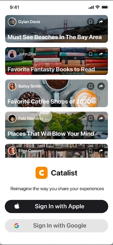
- Sign in with Apple or Google for easier access. Also added a guided onboarding process.


- Users can view own lists with the option to edit/add items. In item view, they can bookmark and mark item as complete. Edit button is changed to bookmark button for others' lists.
- Create a list by adding a title and items by searching the database. Editing is similar, tap title to change and use add/remove buttons for items.


MVP Implementation
As the team and I started to implement the designs, we soon realized we couldn't implement everything. We prioritized features that users responded well towards and put together a MVP.

We got rid of features such as chatting, filters, and the dining category. Since we already had comments, we didn't think it was necessary to have private chats. Filters can wait as we get more users and categories added. The dining category didn't fit in with the other categories since it required a map.


For the sake of consistency, I put together some components. To help with contrast, I put an overlay over the background images and limited color usage. We also linked the font sizes to the OS dynamic text setting option to make the app more accessible.


While launching, we had several hiccups. The main one being our app getting rejected from the App Store twice. We needed to have a report button on every screen that had user comments. We were able to patch up the issues and get our MVP approved for the App Store.
MVP Validation
After about two months of launching our MVP in the App Store, we got decent usage. We used Google Analytics to track usage, which helped us early validate our MVP.
From our early research data, users usually looked for something to do every 2-3 days. This aligned with the DAU/WAU ratio we got from our MVP. Users were also spending an average of 6 minutes on the app versus 15 mins on the individual category apps. This meant that they were spending less time researching for content to consume.
One thing to note is that there are creators and followers. There are those who create lists to share with others, and those that follow lists to look for something to do. 41% of users created at least one list and 33% followed at least one list. This was a great sight to see because users were sharing and saving lists.
We were quite surprised when 29% of users completed at least one list. Our research data suggested more than half of the users would do it. Our hypothesis was users not wanting to mark an item complete, until they finished the series. Talking to a small group of users helped confirm this.
Next Steps & Reflection
The process of creating a product from zero to one with limited resources was eye-opening. We had to prioritize which features to focus on, and adapt to the different situations that came up. Overall, it was a great learning experience. It taught me how to evaluate tradeoffs and prioritization.
There are a bunch of things we can fix from our MVP, such as the complete or save features. We have a roadmap of features that we want to implement. We would like to continue digging into the data and scaling Catalist. But with limited resources and time, this project is currently on pause. The MVP is still live in the App Store.
Here are the key takeaways from this project:
- Building a product from zero to one is tough. There needs to be a good understanding of the domain and its competitors. It requires a lot of research and learning things that might not be design-related.
- Don't get ahead of yourself. Having a plan is great, but things change. Be prepared to move on from ideas that required a lot of invested time.
- Communicate early to save time. Interact and communicate designs with the engineering team early. This will prevent extra work, and help understand if a design is feasible.