An interactive map that show users job in their local area.

Overview
My role was to design features from zero to one and develop the UI for a responsive web app. I collaborated with engineers and designers on research and setting up the backend. My contribution led to increases in engagement and revenue.
Features
Here are some of the impactful features that I designed and implemented. For develpoment, the tech stack used was Next.js, Typescript, and Tailwind CSS. Contact me to learn more about the process for each feature.
0 Result State
Users kept landing on a 0 result page without any content or CTAs. This feature introduced a 0 result state, where users could go to different slug pages to view more jobs.

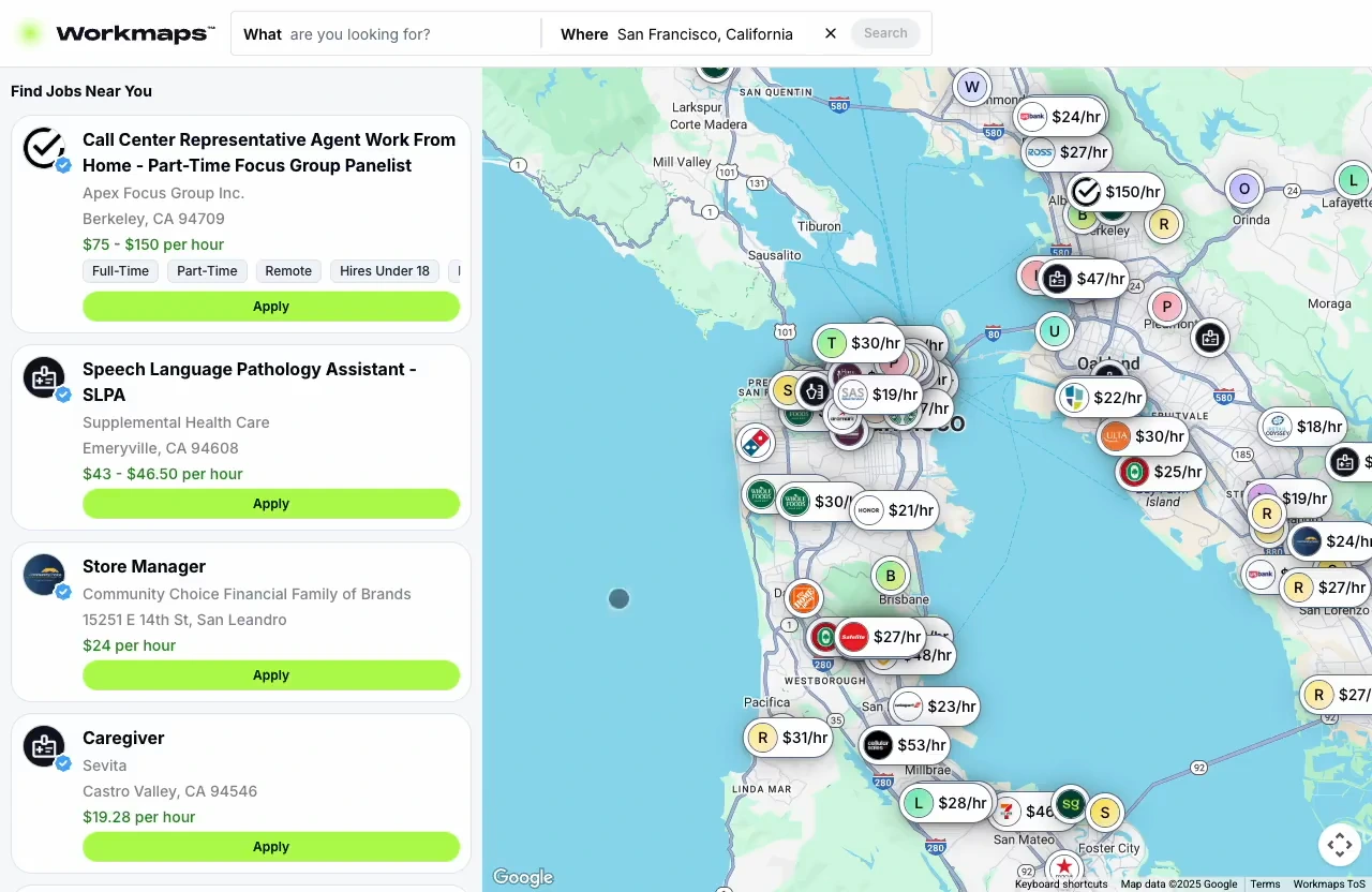
Map/List View
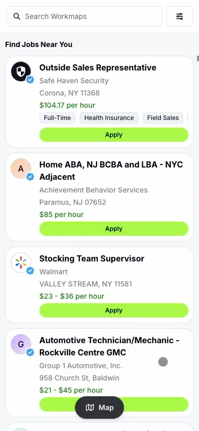
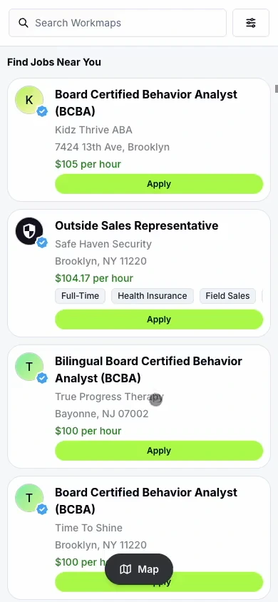
This feature introduced the ability to switch from list view to map view and vice versa on mobile. It also included the ability to view employer cards and job descriptions on the map.


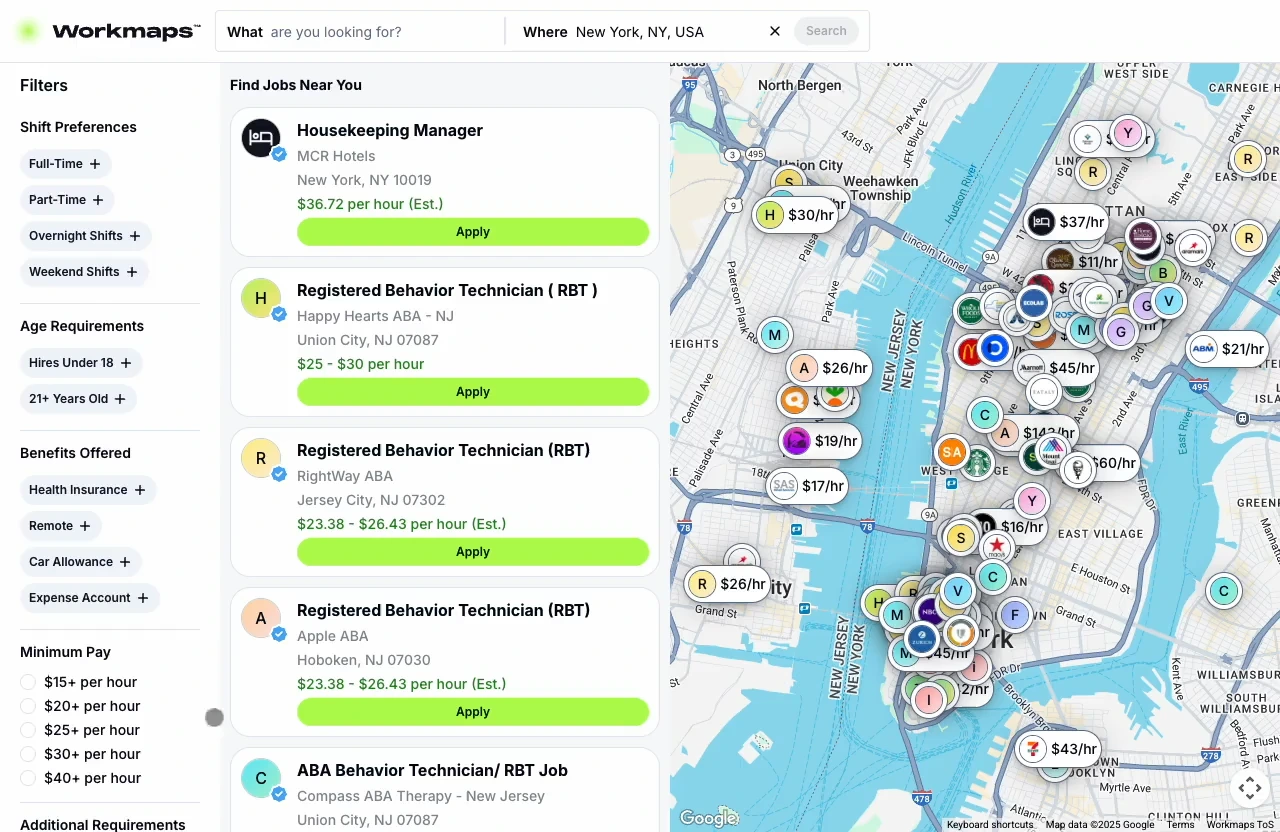
Sidebar Filters
The previous filters were behind an extra click at the top header. After moving and updating the filters to the sidebar, we saw an increase in overall metrics.

Job Description Summary
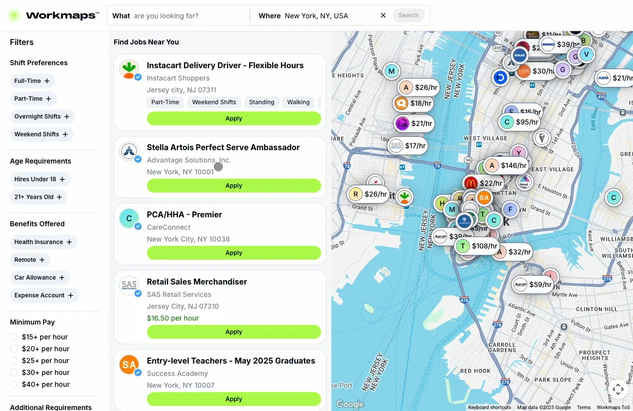
This feature updated job descriptions to include better section summaries. We used AI to summarize the long job descriptions into concise sections.

Mobile Search & Filters
This feature introduced an updated mobile search and filters. It improved the mobile search and filter experience.


Component System
I worked on the building blocks for a design system. It was something we needed so anyone can drag and drop their ideas into Figma without a designer.

Reflection
There was a lot of features that made it to implementation. But, not all got a full release because it either got scrapped or didn't perform well in the A/B tests.
Here are the key takeaways while working on this product:
- The plan and roadmap is always adapting. New and existing features can get delayed to a later release date. Continue to communicate and stay updated with what's happening.
- Designs fail and that is okay. There is no such thing as a perfect solution, things can and will break during testing. Don't see it as a failure, but rather a lesson for the future.
- Change takes time. Be persistent and continue building rapport. Never stop advocating for the user. But understand that the business side of things can slow things down.