An inventory management app that organizes and keeps track of food items and spend.


Overview
The team consisted of seven people and we built the product from zero to one. I worked with a product manager, a branding designer, and four engineers. My role was Lead Product Designer. I designed, prototyped, tested the screens and wrote the UX copy. I collaborated with the team on research, implementation, and QA. We launched an early version of the app in the App Store and will continue to iterate on features. The project took ten months.
Problem
Food waste is a growing global problem that continues to affect the environment. Food production exceeds consumption and edible food is often thrown away. This comes from forgetting about its existence. And also, not knowing how to judge the expiration date of an item.
Goals
- Organize and track food inventory.
- Create a less tedious process to add food items into inventory.
- Help users better understand food and spending habits.
Solution
We got a better understanding of food waste in the US by doing research and interviewing users. After seeing what features competitors already had, we were able to narrow our focus down. We decided on food inventory management and budgeting. I put together wireframes and iterated on them from feedback. We launched version 0.9 in the App Store.
- Add items through scanning a receipt.
- Manually add items through search.
- Track spend through expense report.
Process
The process was an iterative agile process. We went back to previous steps as we tested and gathered more feedback from stakeholders and users.
Understand Food Waste
The team and I kicked off our research by getting a better understanding of food waste. I spoke with six people about their food habits. They were frequent grocery shoppers, in the age range of 27-40. They lived with their partner or have families. I also researched competitor products with the team.

Consumers are by far, the biggest contributors of food waste. Below are some quotes that help explain how big of an issue it has become in the U.S.
Food is the largest single source of waste in the U.S. More food ends up in landfills than plastic or paper (source: NPR).
In 2018 EPA estimates that more than 63 million tons of wasted food was generated, and about 40 percent came from households (source: United States Environmental Protection Agency).
Experts have projected that reducing food losses by just 15 percent would provide enough food for more than 25 million Americans every year (source: U.S. Department of Agriculture).

Synthesize & Explore Competitors' Features
For the user interviews, I summarized the responses into four main categories. These insights were helpful in figuring out how users managed their items and budgeting. It also helped us with pain points prioritization.
- Manage and keep track of inventory and budget
- Cut spending on unnecessary items
- Maintain healthly lifestyle and lower carbon footprint
- Don't throw away food that is still edible
- Discover recipes to use up extra ingredients
- Difficult to share or trade food items
- Forgetful of what items exist at home
- Uncertain of item expiration without expiration labels
- Hard to keep track of spend for wasted items
- Inputting items manually can be time-consuming
- Write grocery list items down on phone or paper
- Rarely spend time checking inventory, just go out and buy
- Use credit card statements to keep track of budget
- Whiteboard, paper, and stickie notes
- Software and apps for different use cases (Excel, Mint, Tasty, Notes, banking apps, etc.)
The team narrowed down the competitors with a focus on five features. Those five features turned to two—food inventory management and budgeting. We agreed that these two features would offer more value than the other three. It also would be easier to implement.

Focus on Food Management & Budgeting
After going through the competitor apps and findings with stakeholders, I put together a user flow. It focuses on users adding items through two options, manual option and receipt scanning. Then users can mark their items to track their expenses. The receipt scanning feature was something the stakeholders thought was an absolute must-have.

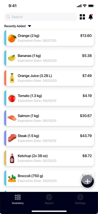
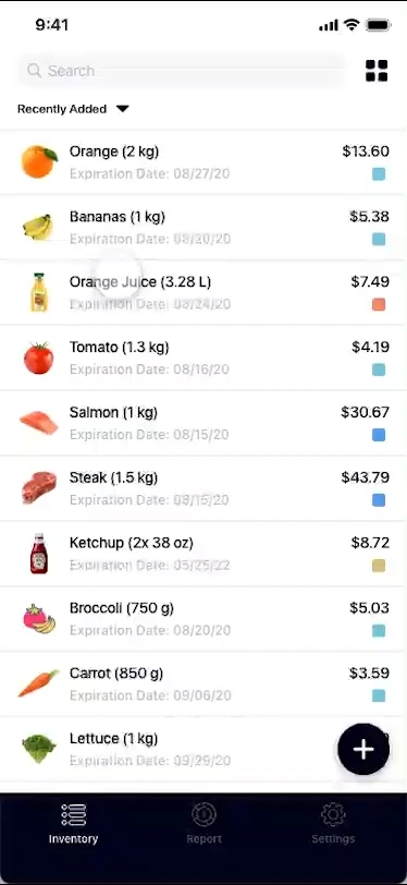
I mocked up some Lo-Fi wireframes using the flow above. After several iterations, I made sure that both features had the necessary visual information for their main screen. The inventory screen had item cards with the following information—name, expiration date, and price. The expense report screen mapped out the different categories of spend.


Test Ideas Using Early Prototype
I converted the Lo-Fi wireframes into an early clickable prototype. I asked seven participants to complete a list of tasks and any suggestions they had. The participants completed most of the tasks with ease, except the swipe actions. Several of them recommended creating a tutorial to make it clearer. The swipe actions redesign got pushed back and will launch at a later date.

Refine Designs & Continue Iterating
After countless iterations, here were some of the crucial changes.
- Users have three methods to find and organize their items. They can search, filter by category, and sort items using five different options.


- The expense report shows a category breakdown for better insights into spending habits. Also have the option of filtering the report by time periods.


- Made the add/edit item screen more accessible with labels. Added optional fields and default category images to speed up process of adding items.


- More control for users by letting them allow/not allow access to camera and photos. Item names and default images now populates after OCR (optical character recognition) receipt scan.


Handoff & Implementation
There was a lot of back and forth between the teams on what and how to proceed. One of the core features that we delayed was the reminders feature. Feedback and discussions told us that the feature wasn't quite where we wanted. We used Adobe XD's specs and commenting for developer handoff with the updated prototype.


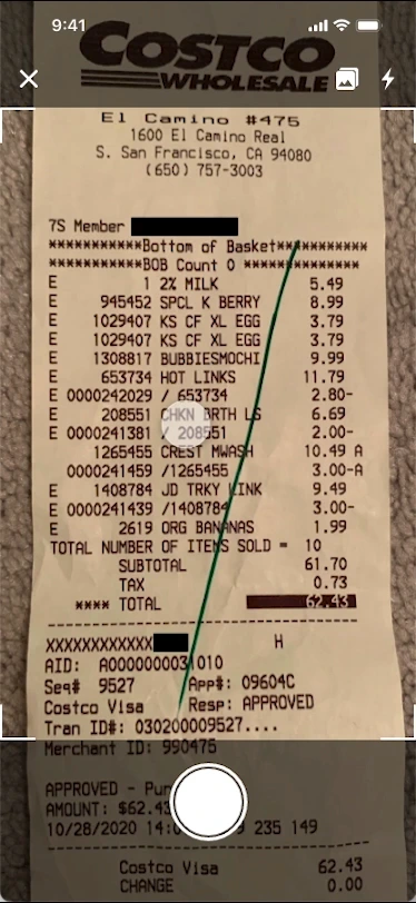
Receipt Scan Iteration
The receipt scan flow needed some updates. Users had trouble scanning their receipts. They couldn't add missing items from the scan. And the error alerts needed a copy update.
Identify Opportunities
I went through our current scan flow and identified some areas where we could improve.
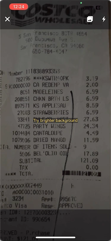
- Scan won't work until OCR (optical character recognition) recognizes receipt.
- Present error alert before photo capture.
- Let users know which items need required information.


I put together an updated user flow with two new error breakpoints. The first breakpoint prevents the user from capturing the photo if there's an error. This should prevent capturing unnecessary photos. The second breakpoint will let users know which items still need required information. This should signal to the user on the items that need updating.

Partner With Engineers On Ideation
The engineers and I discussed how the accuracy threshold for the scan was around 80-90%. And the two main analysis errors were brightness and blurriness. I came up with some different copies and decided on the two versions below. After some internal feedback, we decided on the short form error messages. It was easy to scan and straight to the point.
- Got rid of the "SAMPLE TEXT SIZE", as it was misleading.
- Updated the capture box to accommodate for smaller device types.
- Moved the alert to the center of the screen. Capture button disappears when error is active.


I also made some updates to the second part of the scan flow. These features were missing in the first launch. And it made the scan difficult for users to complete. The item card got redesigned from a previous project.
- Added "Required information missing" alert, along with red dot indicators.
- Option to change Purchase Date for all items at once.
- Can now add missing items from the scan without having to wait or go back.


Design New Receipt Scan
After getting the screens and the copy down, I put together a prototype for testing. In this phase of testing, we didn't include the real-time errors. We decided it was better to do it in-house with different edge cases.
- Wider capture box for scan.
- New error alerts and indicators.
- Globally change purchase date.
- Add missing item after scan.
- Option to delete card and undo action.
Test Error Handling
We tested the live error handling in-house. We wanted to account for as many edge cases as we could. These included faded, wrinkled, and marked receipts. Also wanted to make sure the 80-90% threshold accuracy remained the same with the new changes. The decision was to stick with the two error alerts, and add more when needed.
- Capture button disappears on errors.
- Brightness error on dark background.
- Adjust error when receipt is not recognized.
Conclusion
After about a month of the updates, we saw improvements in our metrics. The new error alerts and disabled capture button prevented unnecessary photos. The updated UI and indicators also helped more users complete their receipt scan. We also reduced future cost by getting rid of unnecessary photos in storage.
Item Card Iteration
Users were struggling with the swipe feature. The card design didn't provide us with enough flexibility. It wasn't designed wide enough for us to implement future features on our roadmap. A lot of them had no clue that this feature existed.
Short-Term Tutorial Fix
The current item card didn't offer a swipe experience that users expected. The short-term fix was effective in that it almost doubled.
But there were still some complaints about the experience not being ideal.
The tutorial helped explain the feature better, but it's still hard to get the swipe options opened.
It's a bit buggy, where sometimes swiping doesn't always reveal the options. The options also need to be wider as misclicks happen way too often.
The tutorial was helpful, but the swiping didn't feel like a natural experience.


Focus On Native iOS
With the app being only in the App Store, the team agreed to focus on a native iOS design. The feedback from the short-term fix and seeing iOS 15's new swipe actions made it an easy decision. The goal was to make the swiping experience more natural. And to widen the click box, so there would be less misclicks.


Through each iteration, we maintained the same design elements. The click box now has a wider click radius. The Finished and Expired actions are on opposite swipes with labels. The edit action now occurs by tapping the item card. The undo message was also updated to include a better explanation.
- Swipe right to mark item as finished.
- Swipe left to mark item as expired.
- Tap card to open item info screen.
- Tap 'Delete Item' to delete card.
- Tap 'Undo' to revert changes.
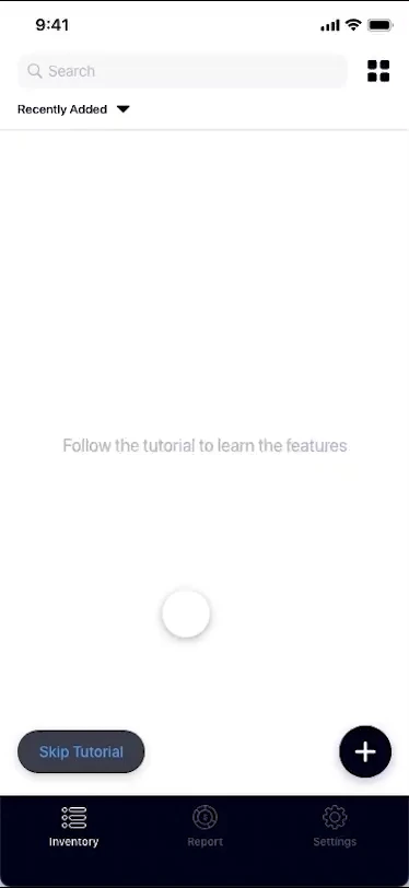
Design New Tutorial
Users struggled with a simple tutorial. We decided to make it a bit more interactive with animation guides and overlays. I created a simple tapping and sliding animation using After Effects.


I put the tutorial screens together, along with the animations, to create a tutorial prototype. When we were testing internally, someone brought up having the ability to skip. The team then discussed how existing users might want to skip the tutorial as well. So we decided to add a "Skip Tutorial" button to give users that option.
- Added swipe and tap animations.
- Added worded description for each step.
Consider Future Features & Tradeoffs
The general consensus among the stakeholders was that the new design was smoother. It provided us with more flexibility to add new features. The work in progress features below include—reminders, groups, storage filters, and multi-select. Before implementation, we wanted to make sure this new card design could scale with our roadmap.


The team decided not to implement all the changes.
- Instead of having users go through each step of the tutorial, we created a video to speed up some of the process.
- Due to timing, we didn't update the undo button and left it as it was in the previous design.
- The delete button wasn't implemented in this iteration.


Conclusion
The redesign and adding the tutorial helped guide users and we saw an increase in engagement.
However, we weren't able to implement all the changes.
- Instead of having users go through each step of the tutorial, we created a video to speed up some of the process.
- Due to timing, we didn't update the undo button and left it as it was in the previous design.
- The delete button wasn't implemented in this iteration.
Reflection
- Tradeoffs and disagreements will occur. The goal is to get on the same page through compromise. Then come up with the best path forward.
- It's okay if production doesn't match handoff. Priorities and designs are always shifting. Document the inconsistencies and advocate for them to get fixed.
- The end goal differs for each feature. Aligning both business and user needs requires balance. When they both have the same goal, it becomes an amazing collaborative effort.